aquarius
Companion app for a portable water quality tester that allows users to interpret and share test results.
Project Type: Mobile app + branding
Role: UX/UI designer
Industry: Health, Lifestyle
Tools: Figma, Adobe CS
Duration: August 2025
Read
More
Introduction
Aquarius set out to make water quality testing accessible, accurate, and immediate. For me, this project was all about designing an experience that could turn raw data into something clear, useful, and actionable for water users. As the product and UX designer, I was involved from research and strategy through to design execution, working across both the physical tester and the digital experience. My goal was to make sure every interaction felt effortless and meaningful, ensuring every element reflected the needs of the end user.
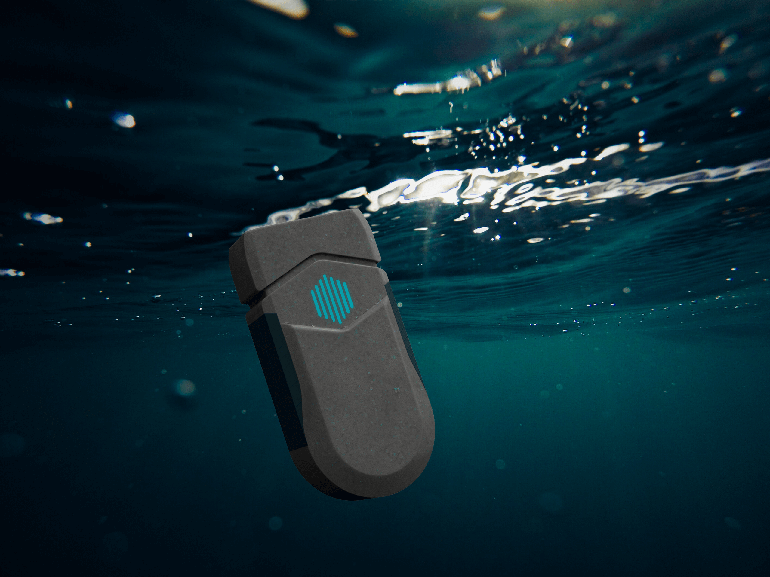
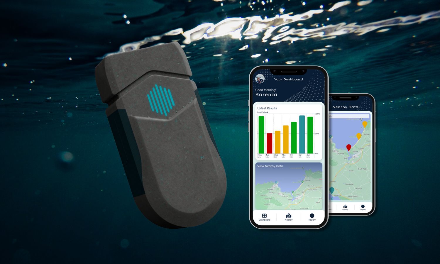
The Product
The Aquarius water quality tester is a physical device that measures bathing water quality in real time, but on its own,
the data it collects can be difficult to interpret. That’s where the Aquarius app comes in, it provides users with an
intuitive way to understand their device's results, track changes over time, and share insights when needed.
This project focused solely on designing the app experience. The core product and its user needs had already been
explored during my final year studying BA Industrial Design & Technology.
If you'd like to find out more about the product, I designed a simple startup website for Aquarius that can be found
here.
Understanding User Needs
Target Audience
A broad spectrum of water users were considered for Aquarius, outdoor enthusiasts and everyday community members were the key
target audience, however environmental researchers and local government agencies were part of the wider audience.
User Pain Points
- Test results are difficult to interpret without clear visuals or context.
- Data systems are fragmented, with no easy way to compare results over time or across locations.
- Users struggle to trust raw data without supporting explanations or guidance.
- Limited ability to share results quickly and reliably with others.
- Lack of personalised insights or alerts when water quality is poor.
- Current interfaces for similar tools often feel overly technical and intimidating.
User Needs
- A clear, intuitive way to understand water quality results at a glance.
- Visual dashboards and trends to compare data across time and locations.
- Explanations and actionable insights that put test results into context.
- Simple tools to share results instantly with communities, friends, or authorities.
- Personalised notifications to stay informed about significant changes in water quality.
- A clean, approachable interface that feels easy for anyone to use, regardless of technical background.
Prototyping + Testing User Flows
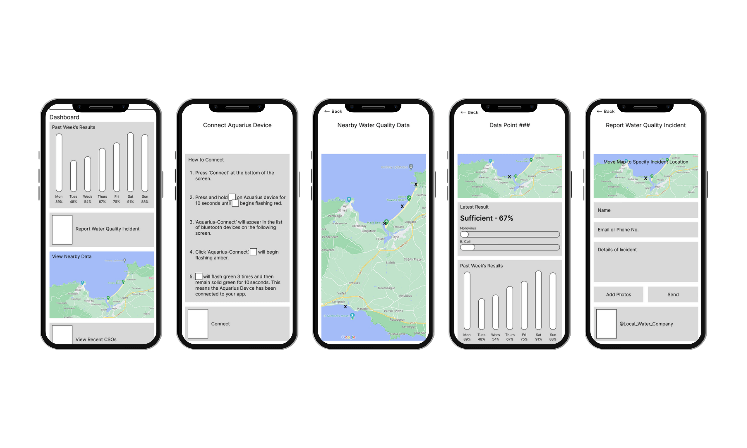
Lo-Fi Prototype
I developed a lo-fi prototype in Figma focused purely on functionality and the user journey, built directly from the user
pain points and needs. These simple wireframes mapped out the core tasks that users needed to perform: viewing real-time
readings, interpreting results and sharing data. This made it easier to validate the app’s navigation and information
hierarchy, serving as a blueprint that could be quickly adjusted based on feedback before committing to a final interface.
User Testing
Testing sessions were an essential part of shaping the app’s design. By asking participants with varying technical abilities
to complete key tasks, I was able to observe where navigation felt intuitive and where users became stuck. Their feedback
revealed opportunities to make the interface clearer, more approachable, and better suited for both scientific and general
audiences.
Opportunities for Improvement
- Strengthen visual cues with clearer icons, colour coding and, brand identity.
- Add short explanations alongside raw data for easier interpretation.
- Add onboarding guidance to help first-time users understand the app quickly.
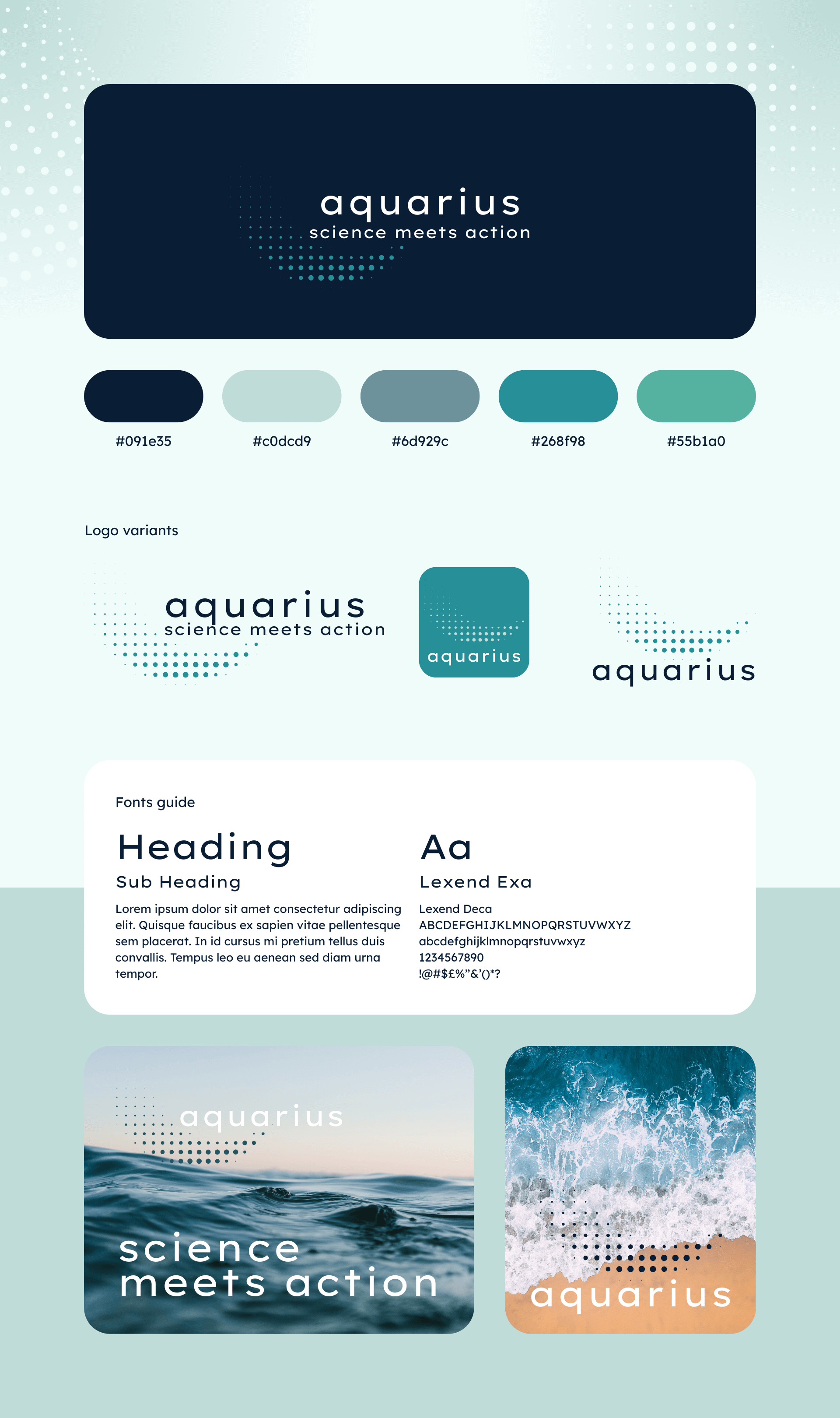
A Cohesive Physical + Digital Brand
The Aquarius brand needed to bridge the gap between the specialist data and wider public knowledge, projecting credibility for more technical audiences while remaining understandable for everyday activists. I developed a cohesive visual identity that could live both on the physical device and in the digital experience. The colour palette, typography and imagery were chosen to convey clarity, trust and innovation, whilst the simple but flexible logo would allow the brand to adapt across packaging, app interface and marketing channels.
Testing the Changes
With the new brand identity in place and improvements from the lo-fi prototype incorporated, I developed a hi-fi prototype to test how the app felt in a more realistic context. The updated design gave users a clearer sense of the app’s personality and purpose, while refining navigation and visuals based on earlier feedback. Testing the hi-fi version showed noticeable progress in usability and overall appeal, but also revealed that some interactions still needed attention before the app could feel truly seamless.
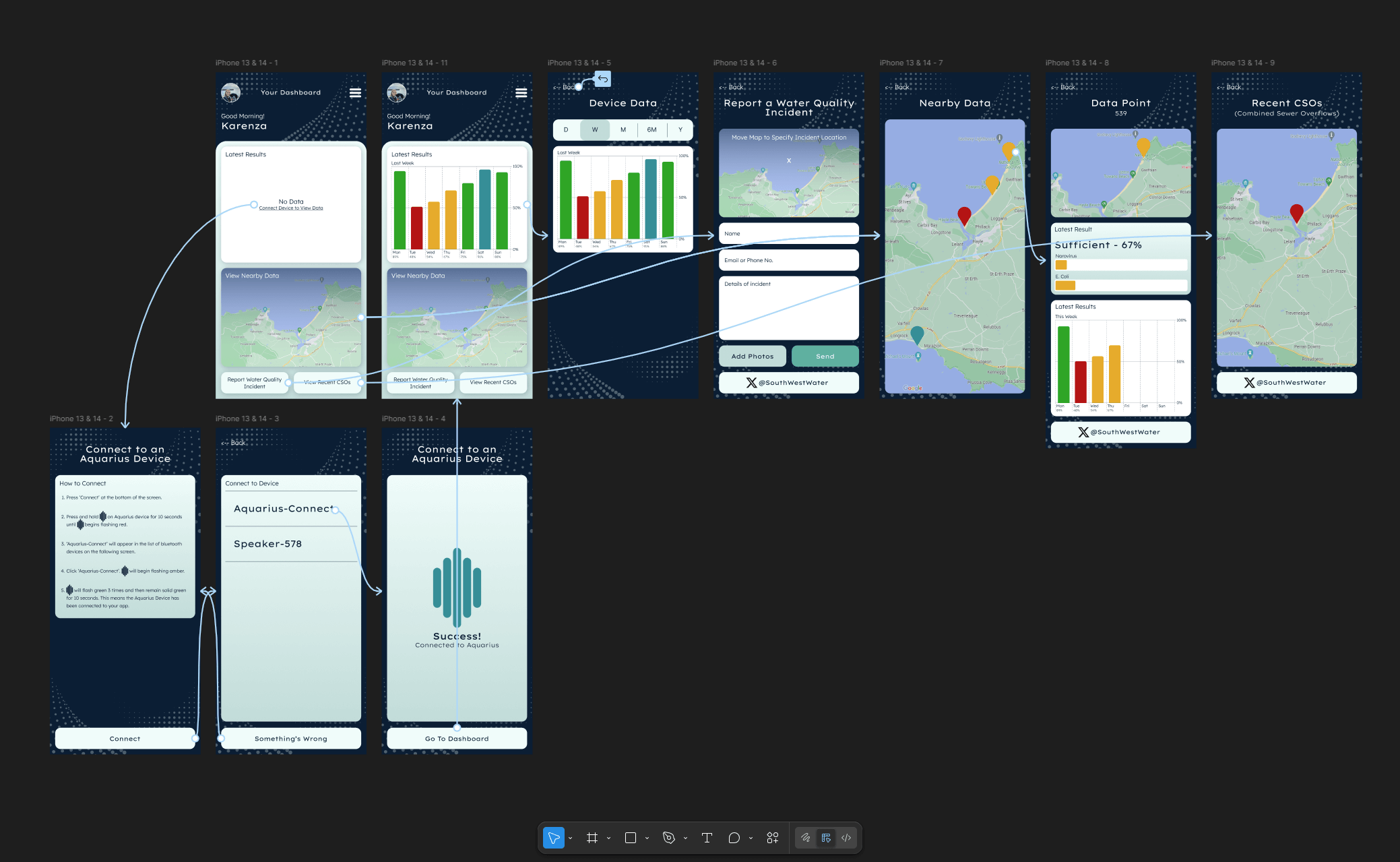
What still isn't working?
- Navigation between sections still felt slightly disjointed.
- Explanations are needed for individual location data.
- Onboarding guidance needs to be more prominent for first-time users.
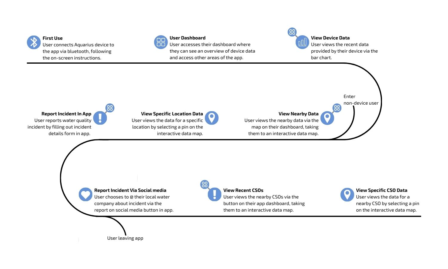
User Journey Mapping
After several rounds of prototyping, it became clear that each iteration introduced new changes without fully resolving the bigger
picture of how users moved through the app. Features were improving in isolation, but the overall flow still lacked cohesion.
To address this, I stepped back and mapped out the whole user journey. This exercise helped me visualise the entire experience,
highlighting not just individual screens but also the emotions, expectations, and potential frustrations at each stage.
Looking back, this should have been incorporated much earlier in the design process, as it provided a clear framework for decision-making
and helped ensure that every design choice supported a seamless, consistent user experience.
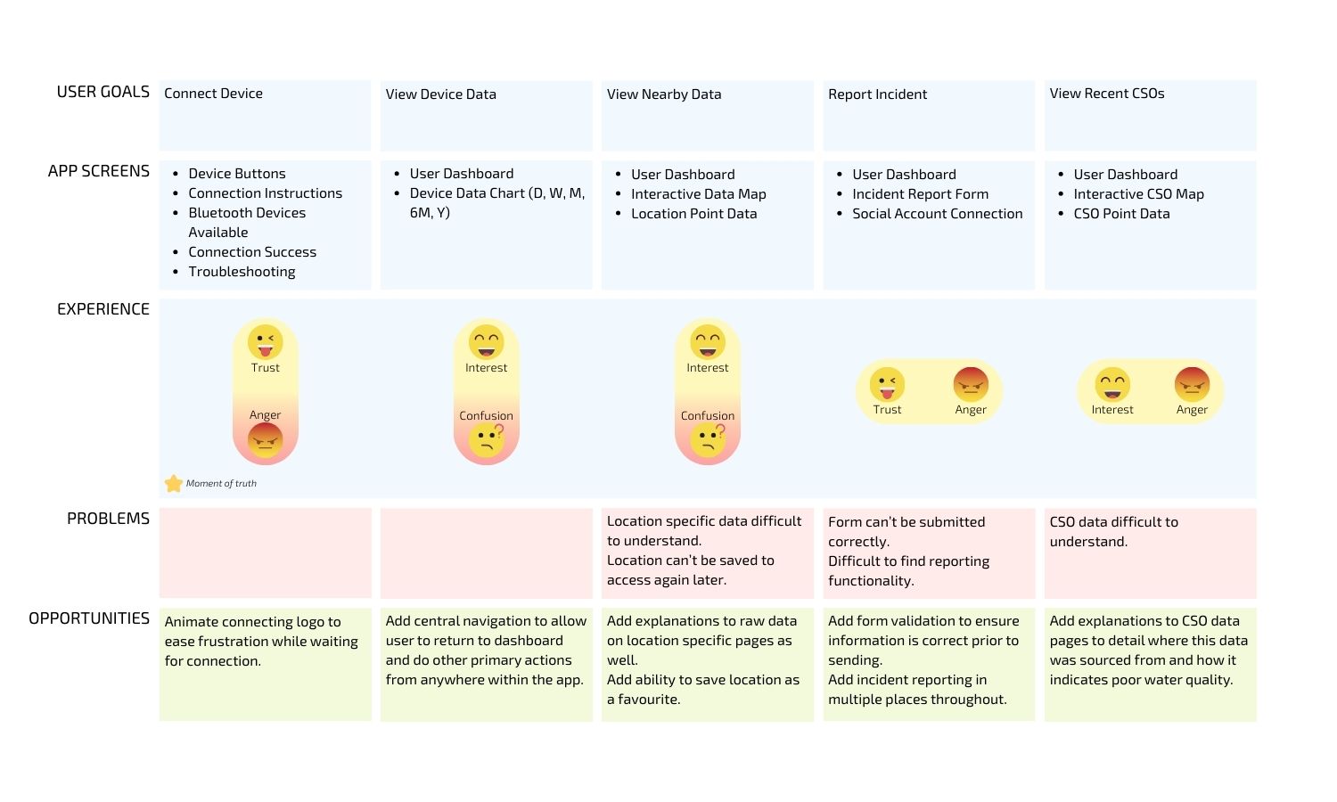
What changes need to be made?
- Add central navigation for doing primary actions from anywhere within the app.
- Integrate searching within the nearby data interactive map.
- Add the ability to favourite a particular location.
- Incident reporting should be available in more places throughout the app.
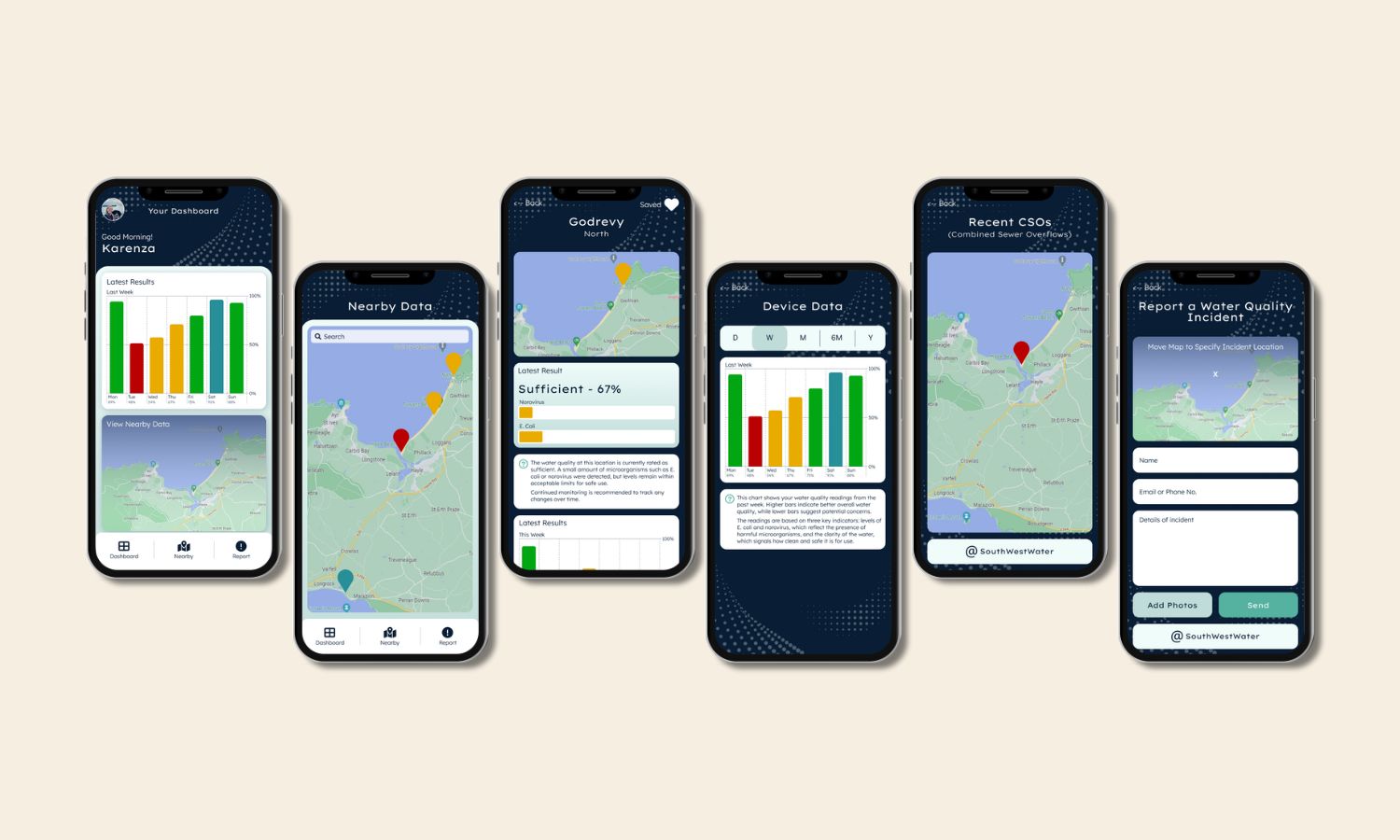
The Final Solution
The final outcome was a mobile app and brand identity that brought together both the physical product and digital
experience of Aquarius in a way that felt consistent and approachable. My goal was to empower users to not only see
their water quality data in real-time but also to truly understand it and share it with confidence. The visual identity
gave Aquarius a strong presence across touchpoints, while the app design translated complex scientific data into
something clear and actionable for everyday users. Together, these elements addressed the original pain points and
positioned Aquarius as a credible voice in citizen science and environmental action.
If this product were to go to market, my next steps would be focused on refining and scaling the app experience.
I’d look to integrate richer data visualisations and personalised insights, so users could better understand the
long-term trends in their local water quality. Accessibility would also be a priority, ensuring the app works seamlessly
across devices and is inclusive for all user groups. Finally, I’d explore features for better dataset building, such as
contributing to larger environmental datasets and building a round-the-clock water quality monitoring model, so the app
could better serve it's users and support collective action.